
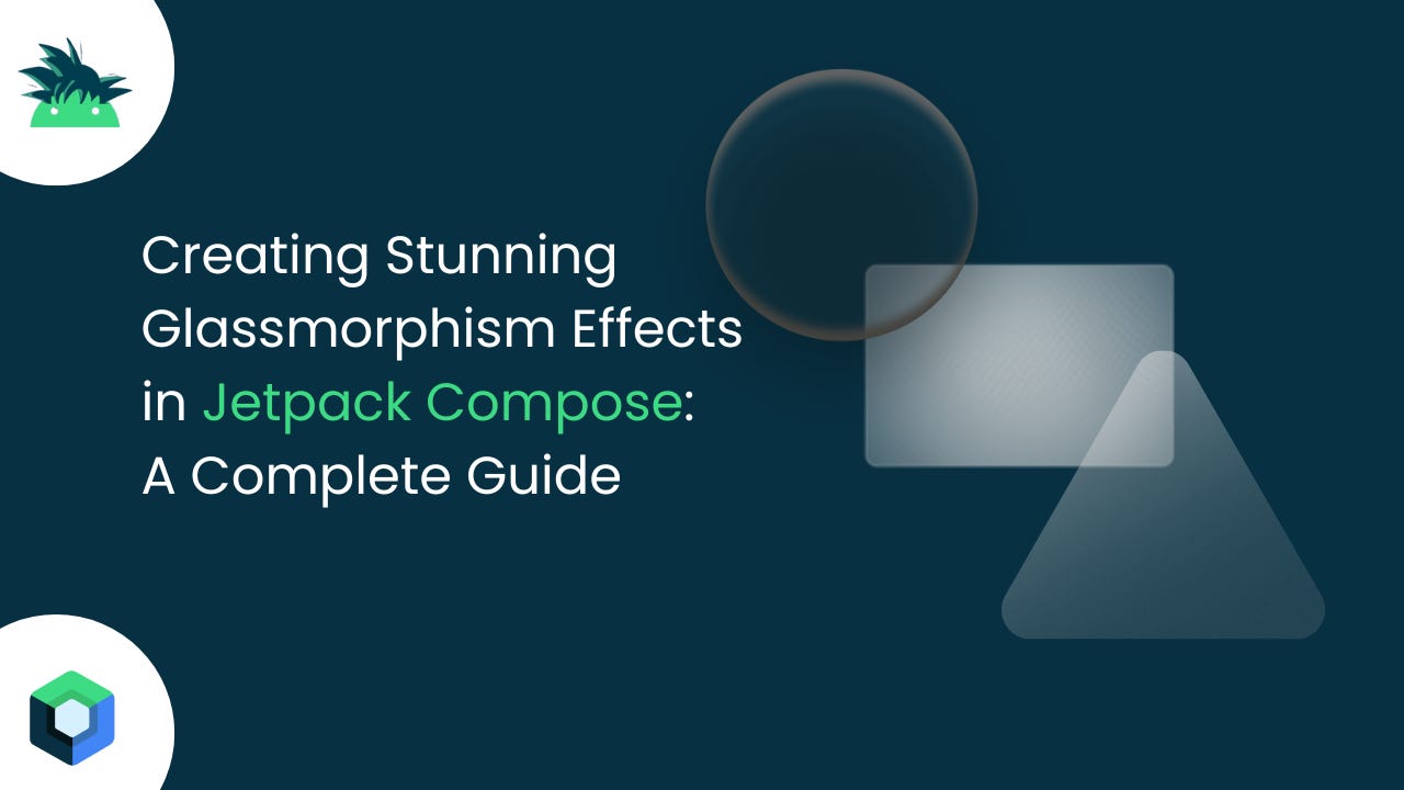
Creating Stunning Glassmorphism Effects in Jetpack Compose
A Complete Guide

Glassmorphism has become one of the most sought-after design trends in modern UI development. Its translucent, frosted-glass aesthetic creates depth and visual hierarchy while maintaining a clean, modern appearance. But can you achieve these beautiful effects directly in Jetpack Compose without external libraries? The answer is absolutely yes!
What is Glassmorphism?
Glassmorphism is a design trend characterized by:
Semi-transparent backgrounds with blur effects
Subtle borders and highlights
Multi-layered depth perception
Frosted glass appearance
Vibrant background elements showing through
Popular apps like iOS Control Center, Windows 11, and many modern web applications use glassmorphism to create immersive user experiences.
The Challenge with Jetpack Compose
Unlike CSS, which has built-in backdrop-filter: blur() support, Jetpack Compose doesn't have native backdrop blur functionality. However, we can create convincing glassmorphism effects using clever combinations of:
Semi-transparent overlays
Gradient backgrounds
Border styling
Shadow effects
Strategic layering
Implementation: Step-by-Step Guide
Let's build a glassmorphism card component that you can use in your Android applications.
Basic Glassmorphism Card
import androidx.compose.foundation.background
import androidx.compose.foundation.border
import androidx.compose.foundation.layout.*
import androidx.compose.foundation.shape.RoundedCornerShape
import androidx.compose.material3.*
import androidx.compose.runtime.Composable
import androidx.compose.ui.Alignment
import androidx.compose.ui.Modifier
import androidx.compose.ui.draw.clip
import androidx.compose.ui.graphics.Brush
import androidx.compose.ui.graphics.Color
import androidx.compose.ui.text.font.FontWeight
import androidx.compose.ui.unit.dp
import androidx.compose.ui.unit.sp

@Composable
fun GlassmorphismCard(
    modifier: Modifier = Modifier,
    content: @Composable ColumnScope.() -> Unit
) {
    val glassBrush = Brush.linearGradient(
        colors = listOf(
            Color.White.copy(alpha = 0.25f),
            Color.White.copy(alpha = 0.1f)
        )
    )

    Card(
        modifier = modifier
            .clip(RoundedCornerShape(20.dp))
            .background(glassBrush)
            .border(
                width = 1.dp,
                brush = Brush.linearGradient(
                    colors = listOf(
                        Color.White.copy(alpha = 0.4f),
                        Color.White.copy(alpha = 0.1f)
                    )
                ),
                shape = RoundedCornerShape(20.dp)
            ),
        colors = CardDefaults.cardColors(
            containerColor = Color.Transparent
        ),
        elevation = CardDefaults.cardElevation(
            defaultElevation = 8.dp
        )
    ) {
        Column(
            modifier = Modifier.padding(24.dp),
            content = content
        )
    }
}
Enhanced Glassmorphism with Multiple Effects
For a more sophisticated approach, here's an enhanced version with better visual effects:
@Composable
fun EnhancedGlassmorphismCard(
    modifier: Modifier = Modifier,
    content: @Composable ColumnScope.() -> Unit
) {
    Box(
        modifier = modifier
            .clip(RoundedCornerShape(24.dp))
    ) {
        // Background blur simulation
        Box(
            modifier = Modifier
                .matchParentSize()
                .background(
                    brush = Brush.radialGradient(
                        colors = listOf(
                            Color.White.copy(alpha = 0.3f),
                            Color.White.copy(alpha = 0.1f),
                            Color.White.copy(alpha = 0.05f)
                        )
                    )
                )
        )

        // Glass surface
        Card(
            modifier = Modifier
                .matchParentSize()
                .border(
                    width = 1.5dp,
                    brush = Brush.linearGradient(
                        colors = listOf(
                            Color.White.copy(alpha = 0.5f),
                            Color.White.copy(alpha = 0.1f),
                            Color.White.copy(alpha = 0.8f)
                        )
                    ),
                    shape = RoundedCornerShape(24.dp)
                ),
            colors = CardDefaults.cardColors(
                containerColor = Color.Transparent
            ),
            elevation = CardDefaults.cardElevation(
                defaultElevation = 12.dp
            )
        ) {
            Column(
                modifier = Modifier.padding(28.dp),
                content = content
            )
        }
    }
}
Complete Example with Background
Here's a full example showing glassmorphism cards over a colorful background:
@Composable
fun GlassmorphismDemo() {
Box(
modifier = Modifier
.fillMaxSize()
.background(
brush = Brush.verticalGradient(
colors = listOf(
Color(0xFF667eea),
Color(0xFF764ba2),
Color(0xFFf093fb)
)
)
)
) {
// Background decorative elements
Box(
modifier = Modifier
.size(200.dp)
.offset(x = (-50).dp, y = 100.dp)
.clip(CircleShape)
.background(Color.White.copy(alpha = 0.1f))
)
Box(
modifier = Modifier
.size(150.dp)
.offset(x = 250.dp, y = 300.dp)
.clip(CircleShape)
.background(Color.Yellow.copy(alpha = 0.2f))
)
Column(
modifier = Modifier
.fillMaxSize()
.padding(24.dp),
verticalArrangement = Arrangement.spacedBy(24.dp)
) {
Spacer(modifier = Modifier.height(60.dp))
// Profile Card
EnhancedGlassmorphismCard(
modifier = Modifier.fillMaxWidth()
) {
Row(
verticalAlignment = Alignment.CenterVertically,
horizontalArrangement = Arrangement.spacedBy(16.dp)
) {
Box(
modifier = Modifier
.size(60.dp)
.clip(CircleShape)
.background(Color.White.copy(alpha = 0.3f)),
contentAlignment = Alignment.Center
) {
Text(
text = "👨💻",
fontSize = 28.sp
)
}
Column {
Text(
text = "John Developer",
fontSize = 20.sp,
fontWeight = FontWeight.Bold,
color = Color.White
)
Text(
text = "Android Engineer",
fontSize = 14.sp,
color = Color.White.copy(alpha = 0.8f)
)
}
}
}
// Stats Card
GlassmorphismCard(
modifier = Modifier.fillMaxWidth()
) {
Text(
text = "Statistics",
fontSize = 18.sp,
fontWeight = FontWeight.Bold,
color = Color.White,
modifier = Modifier.padding(bottom = 16.dp)
)
Row(
modifier = Modifier.fillMaxWidth(),
horizontalArrangement = Arrangement.SpaceEvenly
) {
StatItem("Projects", "24")
StatItem("Reviews", "4.8★")
StatItem("Experience", "5 Years")
}
}
}
}
}
@Composable
fun StatItem(label: String, value: String) {
Column(
horizontalAlignment = Alignment.CenterHorizontally
) {
Text(
text = value,
fontSize = 24.sp,
fontWeight = FontWeight.Bold,
color = Color.White
)
Text(
text = label,
fontSize = 12.sp,
color = Color.White.copy(alpha = 0.7f)
)
}
}Popular Apps Using Glassmorphism
Spotify: Now Playing overlay, playlist cards
Apple Music: Control widgets, artist pages
Instagram: Story overlays, camera filters UI
Banking Apps: Card displays, security overlays
Weather Apps: Current conditions overlays
Control Centers: iOS Control Center, Android Quick Settings
Production-Ready Implementation
1. Music Player Interface (Spotify-Style)
This example creates a music player with glassmorphism effects similar to popular streaming apps:
@OptIn(ExperimentalMaterial3Api::class)
@Composable
fun MusicPlayerGlass(
    currentSong: Song,
    isPlaying: Boolean,
    onPlayPause: () -> Unit,
    onNext: () -> Unit,
    onPrevious: () -> Unit,
    modifier: Modifier = Modifier
) {
    Box(
        modifier = modifier
            .fillMaxSize()
            .background(
                brush = Brush.verticalGradient(
                    colors = listOf(
                        Color(0xFF1DB954).copy(alpha = 0.8f), // Spotify green
                        Color(0xFF191414), // Spotify dark
                        Color(0xFF000000)
                    )
                )
            )
    ) {
        // Background album art with blur effect
        AsyncImage(
            model = currentSong.albumArtUrl,
            contentDescription = null,
            modifier = Modifier
                .fillMaxSize()
                .blur(20.dp)
                .alpha(0.3f),
            contentScale = ContentScale.Crop
        )

        Column(
            modifier = Modifier
                .fillMaxSize()
                .padding(24.dp),
            verticalArrangement = Arrangement.SpaceBetween
        ) {
            // Top Controls (Back, More options)
            TopAppBar(
                title = { Text("Now Playing", color = Color.White) },
                navigationIcon = {
                    IconButton(onClick = { /* Handle back */ }) {
                        Icon(
                            Icons.Default.ArrowBack,
                            contentDescription = "Back",
                            tint = Color.White
                        )
                    }
                },
                actions = {
                    IconButton(onClick = { /* Handle more */ }) {
                        Icon(
                            Icons.Default.MoreVert,
                            contentDescription = "More",
                            tint = Color.White
                        )
                    }
                },
                colors = TopAppBarDefaults.topAppBarColors(
                    containerColor = Color.Transparent
                )
            )

            // Album Art Card with Glassmorphism
            GlassCard(
                modifier = Modifier
                    .size(320.dp)
                    .align(Alignment.CenterHorizontally)
            ) {
                AsyncImage(
                    model = currentSong.albumArtUrl,
                    contentDescription = "${currentSong.title} album art",
                    modifier = Modifier
                        .fillMaxSize()
                        .clip(RoundedCornerShape(16.dp)),
                    contentScale = ContentScale.Crop
                )
            }

            // Song Info with Glass Background
            GlassCard(
                modifier = Modifier.fillMaxWidth()
            ) {
                Column {
                    Text(
                        text = currentSong.title,
                        style = MaterialTheme.typography.headlineSmall,
                        color = Color.White,
                        fontWeight = FontWeight.Bold
                    )
                    Text(
                        text = currentSong.artist,
                        style = MaterialTheme.typography.bodyLarge,
                        color = Color.White.copy(alpha = 0.8f)
                    )

                    Spacer(modifier = Modifier.height(16.dp))

                    // Progress Bar
                    LinearProgressIndicator(
                        progress = currentSong.progress,
                        modifier = Modifier.fillMaxWidth(),
                        color = Color.White,
                        trackColor = Color.White.copy(alpha = 0.3f)
                    )

                    Row(
                        modifier = Modifier.fillMaxWidth(),
                        horizontalArrangement = Arrangement.SpaceBetween
                    ) {
                        Text(
                            text = currentSong.currentTime,
                            color = Color.White.copy(alpha = 0.7f),
                            style = MaterialTheme.typography.bodySmall
                        )
                        Text(
                            text = currentSong.duration,
                            color = Color.White.copy(alpha = 0.7f),
                            style = MaterialTheme.typography.bodySmall
                        )
                    }
                }
            }

            // Control Buttons with Glass Effect
            GlassCard(
                modifier = Modifier.fillMaxWidth()
            ) {
                Row(
                    modifier = Modifier.fillMaxWidth(),
                    horizontalArrangement = Arrangement.SpaceEvenly,
                    verticalAlignment = Alignment.CenterVertically
                ) {
                    IconButton(
                        onClick = onPrevious,
                        modifier = Modifier.size(48.dp)
                    ) {
                        Icon(
                            Icons.Default.SkipPrevious,
                            contentDescription = "Previous",
                            tint = Color.White,
                            modifier = Modifier.size(32.dp)
                        )
                    }

                    // Play/Pause Button with Enhanced Glass Effect
                    FloatingActionButton(
                        onClick = onPlayPause,
                        modifier = Modifier.size(64.dp),
                        containerColor = Color.White.copy(alpha = 0.2f),
                        contentColor = Color.White
                    ) {
                        Icon(
                            if (isPlaying) Icons.Default.Pause else Icons.Default.PlayArrow,
                            contentDescription = if (isPlaying) "Pause" else "Play",
                            modifier = Modifier.size(32.dp)
                        )
                    }

                    IconButton(
                        onClick = onNext,
                        modifier = Modifier.size(48.dp)
                    ) {
                        Icon(
                            Icons.Default.SkipNext,
                            contentDescription = "Next",
                            tint = Color.White,
                            modifier = Modifier.size(32.dp)
                        )
                    }
                }
            }
        }
    }
}
2. Banking App Card Display
Real banking apps use glassmorphism for card displays and security overlays:
@Composable
fun BankingCardGlass(
    card: CreditCard,
    onCardClick: () -> Unit,
    modifier: Modifier = Modifier
) {
    val cardGradient = when (card.type) {
        CardType.PLATINUM -> listOf(Color(0xFFE5E4E2), Color(0xFFC0C0C0))
        CardType.GOLD -> listOf(Color(0xFFFFD700), Color(0xFFFFA500))
        CardType.BLACK -> listOf(Color(0xFF2C2C2C), Color(0xFF000000))
        else -> listOf(Color(0xFF1976D2), Color(0xFF1565C0))
    }

    Card(
        modifier = modifier
            .fillMaxWidth()
            .height(200.dp)
            .clickable { onCardClick() },
        shape = RoundedCornerShape(16.dp),
        elevation = CardDefaults.cardElevation(defaultElevation = 12.dp)
    ) {
        Box(
            modifier = Modifier
                .fillMaxSize()
                .background(
                    brush = Brush.linearGradient(
                        colors = cardGradient.map { it.copy(alpha = 0.9f) }
                    )
                )
        ) {
            // Glass overlay effect
            Box(
                modifier = Modifier
                    .fillMaxSize()
                    .background(
                        brush = Brush.radialGradient(
                            colors = listOf(
                                Color.White.copy(alpha = 0.3f),
                                Color.White.copy(alpha = 0.1f),
                                Color.Transparent
                            ),
                            center = Offset(0.3f, 0.2f)
                        )
                    )
            )

            Column(
                modifier = Modifier.padding(24.dp)
            ) {
                Row(
                    modifier = Modifier.fillMaxWidth(),
                    horizontalArrangement = Arrangement.SpaceBetween,
                    verticalAlignment = Alignment.Top
                ) {
                    Column {
                        Text(
                            text = card.bankName,
                            color = Color.White,
                            style = MaterialTheme.typography.bodyMedium,
                            fontWeight = FontWeight.Bold
                        )
                        Text(
                            text = card.cardType,
                            color = Color.White.copy(alpha = 0.8f),
                            style = MaterialTheme.typography.bodySmall
                        )
                    }

                    // Contactless payment icon
                    Icon(
                        painter = painterResource(R.drawable.ic_contactless),
                        contentDescription = "Contactless",
                        tint = Color.White.copy(alpha = 0.8f),
                        modifier = Modifier.size(32.dp)
                    )
                }

                Spacer(modifier = Modifier.weight(1f))

                // Card number with glassmorphism chip
                Row(
                    verticalAlignment = Alignment.CenterVertically
                ) {
                    // EMV Chip
                    Box(
                        modifier = Modifier
                            .size(32.dp, 24.dp)
                            .clip(RoundedCornerShape(4.dp))
                            .background(
                                brush = Brush.linearGradient(
                                    colors = listOf(
                                        Color.White.copy(alpha = 0.4f),
                                        Color.White.copy(alpha = 0.2f)
                                    )
                                )
                            )
                            .border(
                                1.dp,
                                Color.White.copy(alpha = 0.3f),
                                RoundedCornerShape(4.dp)
                            )
                    )

                    Spacer(modifier = Modifier.width(16.dp))

                    Text(
                        text = card.maskedNumber,
                        color = Color.White,
                        style = MaterialTheme.typography.headlineSmall,
                        fontFamily = FontFamily.Monospace,
                        letterSpacing = 2.sp
                    )
                }

                Spacer(modifier = Modifier.height(16.dp))

                Row(
                    modifier = Modifier.fillMaxWidth(),
                    horizontalArrangement = Arrangement.SpaceBetween
                ) {
                    Column {
                        Text(
                            text = "VALID THRU",
                            color = Color.White.copy(alpha = 0.7f),
                            style = MaterialTheme.typography.labelSmall
                        )
                        Text(
                            text = card.expiryDate,
                            color = Color.White,
                            style = MaterialTheme.typography.bodyMedium,
                            fontFamily = FontFamily.Monospace
                        )
                    }

                    Text(
                        text = card.holderName,
                        color = Color.White,
                        style = MaterialTheme.typography.bodyMedium,
                        fontWeight = FontWeight.Bold
                    )
                }
            }
        }
    }
}
3. Weather App Overlay (iOS Weather Style)
Weather apps commonly use glassmorphism for current conditions overlays:
@Composable
fun WeatherGlassOverlay(
    currentWeather: WeatherData,
    hourlyForecast: List<HourlyWeather>,
    modifier: Modifier = Modifier
) {
    Box(
        modifier = modifier.fillMaxSize()
    ) {
        // Background with weather-appropriate gradient
        Box(
            modifier = Modifier
                .fillMaxSize()
                .background(
                    brush = Brush.verticalGradient(
                        colors = currentWeather.backgroundColors
                    )
                )
        )

        // Animated background elements (clouds, rain, etc.)
        WeatherBackgroundAnimation(currentWeather.condition)

        LazyColumn(
            modifier = Modifier.fillMaxSize(),
            contentPadding = PaddingValues(16.dp),
            verticalArrangement = Arrangement.spacedBy(16.dp)
        ) {
            item {
                // Location and current temp
                GlassCard(
                    modifier = Modifier.fillMaxWidth()
                ) {
                    Column(
                        horizontalAlignment = Alignment.CenterHorizontally
                    ) {
                        Text(
                            text = currentWeather.location,
                            style = MaterialTheme.typography.headlineMedium,
                            color = Color.White,
                            textAlign = TextAlign.Center
                        )

                        Text(
                            text = "${currentWeather.temperature}°",
                            style = MaterialTheme.typography.displayLarge,
                            color = Color.White,
                            fontWeight = FontWeight.Light
                        )

                        Text(
                            text = currentWeather.condition,
                            style = MaterialTheme.typography.bodyLarge,
                            color = Color.White.copy(alpha = 0.8f)
                        )

                        Text(
                            text = "H:${currentWeather.high}° L:${currentWeather.low}°",
                            style = MaterialTheme.typography.bodyMedium,
                            color = Color.White.copy(alpha = 0.8f)
                        )
                    }
                }
            }

            item {
                // Hourly forecast
                GlassCard(
                    modifier = Modifier.fillMaxWidth()
                ) {
                    Column {
                        Text(
                            text = "HOURLY FORECAST",
                            style = MaterialTheme.typography.labelMedium,
                            color = Color.White.copy(alpha = 0.8f),
                            modifier = Modifier.padding(bottom = 12.dp)
                        )

                        LazyRow(
                            horizontalArrangement = Arrangement.spacedBy(16.dp)
                        ) {
                            items(hourlyForecast) { hour ->
                                HourlyWeatherItem(hour)
                            }
                        }
                    }
                }
            }

            item {
                // Weather details grid
                GlassCard(
                    modifier = Modifier.fillMaxWidth()
                ) {
                    LazyVerticalGrid(
                        columns = GridCells.Fixed(2),
                        verticalArrangement = Arrangement.spacedBy(16.dp),
                        horizontalArrangement = Arrangement.spacedBy(16.dp),
                        modifier = Modifier.height(200.dp)
                    ) {
                        item {
                            WeatherDetailItem(
                                icon = Icons.Default.Visibility,
                                label = "VISIBILITY",
                                value = currentWeather.visibility
                            )
                        }
                        item {
                            WeatherDetailItem(
                                icon = Icons.Default.Air,
                                label = "WIND",
                                value = "${currentWeather.windSpeed} mph"
                            )
                        }
                        item {
                            WeatherDetailItem(
                                icon = Icons.Default.WaterDrop,
                                label = "HUMIDITY",
                                value = "${currentWeather.humidity}%"
                            )
                        }
                        item {
                            WeatherDetailItem(
                                icon = Icons.Default.Thermostat,
                                label = "FEELS LIKE",
                                value = "${currentWeather.feelsLike}°"
                            )
                        }
                    }
                }
            }
        }
    }
}

@Composable
fun WeatherDetailItem(
    icon: ImageVector,
    label: String,
    value: String
) {
    Column {
        Row(
            verticalAlignment = Alignment.CenterVertically
        ) {
            Icon(
                imageVector = icon,
                contentDescription = null,
                tint = Color.White.copy(alpha = 0.6f),
                modifier = Modifier.size(16.dp)
            )
            Spacer(modifier = Modifier.width(4.dp))
            Text(
                text = label,
                style = MaterialTheme.typography.labelSmall,
                color = Color.White.copy(alpha = 0.6f)
            )
        }
        Text(
            text = value,
            style = MaterialTheme.typography.headlineSmall,
            color = Color.White,
            fontWeight = FontWeight.Bold
        )
    }
}
4. Enhanced Glass Card Component
Here's the production-ready glass card component used in all examples:
@Composable
fun GlassCard(
    modifier: Modifier = Modifier,
    blur: Dp = 20.dp,
    cornerRadius: Dp = 16.dp,
    borderWidth: Dp = 1.dp,
    alpha: Float = 0.15f,
    content: @Composable ColumnScope.() -> Unit
) {
    Card(
        modifier = modifier
            .clip(RoundedCornerShape(cornerRadius))
            .background(
                brush = Brush.linearGradient(
                    colors = listOf(
                        Color.White.copy(alpha = alpha + 0.1f),
                        Color.White.copy(alpha = alpha)
                    ),
                    start = Offset(0f, 0f),
                    end = Offset(1000f, 1000f)
                )
            )
            .border(
                width = borderWidth,
                brush = Brush.linearGradient(
                    colors = listOf(
                        Color.White.copy(alpha = 0.4f),
                        Color.White.copy(alpha = 0.1f),
                        Color.White.copy(alpha = 0.6f)
                    )
                ),
                shape = RoundedCornerShape(cornerRadius)
            ),
        colors = CardDefaults.cardColors(
            containerColor = Color.Transparent
        ),
        elevation = CardDefaults.cardElevation(
            defaultElevation = 8.dp
        )
    ) {
        Column(
            modifier = Modifier.padding(20.dp),
            content = content
        )
    }
}
5. Data Classes for Examples
data class Song(
    val title: String,
    val artist: String,
    val albumArtUrl: String,
    val duration: String,
    val currentTime: String,
    val progress: Float
)

data class CreditCard(
    val bankName: String,
    val cardType: String,
    val type: CardType,
    val maskedNumber: String,
    val expiryDate: String,
    val holderName: String
)

enum class CardType {
    PLATINUM, GOLD, BLACK, STANDARD
}

data class WeatherData(
    val location: String,
    val temperature: Int,
    val condition: String,
    val high: Int,
    val low: Int,
    val visibility: String,
    val windSpeed: String,
    val humidity: Int,
    val feelsLike: Int,
    val backgroundColors: List<Color>
)

data class HourlyWeather(
    val time: String,
    val temperature: Int,
    val condition: String,
    val icon: String
)
6. Advanced Glass Effects with Animations
@Composable
fun AnimatedGlassCard(
    modifier: Modifier = Modifier,
    content: @Composable ColumnScope.() -> Unit
) {
    var isPressed by remember { mutableStateOf(false) }

    val animatedAlpha by animateFloatAsState(
        targetValue = if (isPressed) 0.3f else 0.15f,
        animationSpec = tween(300)
    )

    val animatedElevation by animateDpAsState(
        targetValue = if (isPressed) 4.dp else 12.dp,
        animationSpec = tween(300)
    )

    Card(
        modifier = modifier
            .clip(RoundedCornerShape(20.dp))
            .background(
                brush = Brush.linearGradient(
                    colors = listOf(
                        Color.White.copy(alpha = animatedAlpha + 0.1f),
                        Color.White.copy(alpha = animatedAlpha)
                    )
                )
            )
            .border(
                width = 1.5.dp,
                brush = Brush.linearGradient(
                    colors = listOf(
                        Color.White.copy(alpha = 0.5f),
                        Color.White.copy(alpha = 0.1f),
                        Color.White.copy(alpha = 0.8f)
                    )
                ),
                shape = RoundedCornerShape(20.dp)
            )
            .pointerInput(Unit) {
                detectTapGestures(
                    onPress = {
                        isPressed = true
                        tryAwaitRelease()
                        isPressed = false
                    }
                )
            },
        colors = CardDefaults.cardColors(
            containerColor = Color.Transparent
        ),
        elevation = CardDefaults.cardElevation(
            defaultElevation = animatedElevation
        )
    ) {
        Column(
            modifier = Modifier.padding(24.dp),
            content = content
        )
    }
}
Key Techniques Explained
1. Layered Transparency
We use multiple layers with different alpha values to simulate depth and the frosted glass effect.
2. Gradient Borders
Linear gradients on borders create the characteristic glass-like highlights and reflections.
3. Strategic Color Mixing
Combining white overlays with varying opacity levels creates the translucent appearance.
4. Elevation and Shadows
Card elevation adds depth and helps separate glass elements from the background.
Tips for Better Glassmorphism
Use Vibrant Backgrounds: Glassmorphism works best over colorful, dynamic backgrounds
Subtle Borders: Keep border opacity low (0.1-0.4) for authenticity
Proper Contrast: Ensure text remains readable over glass surfaces
Consistent Rounded Corners: Use consistent border radius values
Layer Thoughtfully: Don't overuse the effect - less is more
Performance Considerations & Optimization Tips
While our glassmorphism implementation is efficient, keep these points in mind:
Gradient calculations can impact performance on older devices
Use
rememberfor complex brush calculations when possibleConsider providing a simplified version for low-end devices
Test thoroughly on various screen densities
1. Use Remember for Complex Calculations
@Composable
fun OptimizedGlassCard() {
    val glassBrush = remember {
        Brush.linearGradient(
            colors = listOf(
                Color.White.copy(alpha = 0.25f),
                Color.White.copy(alpha = 0.1f)
            )
        )
    }
    // Use glassBrush in your composable
}
2. Conditional Rendering for Low-End Devices
@Composable
fun AdaptiveGlassCard(
    content: @Composable ColumnScope.() -> Unit
) {
    val isHighPerformanceDevice = LocalContext.current
        .getSystemService(Context.ACTIVITY_SERVICE) as ActivityManager
        .let { it.deviceConfigurationInfo.reqGlEsVersion >= 0x30000 }

    if (isHighPerformanceDevice) {
        EnhancedGlassCard(content = content)
    } else {
        SimpleGlassCard(content = content)
    }
}
3. Reusable Glass Theme
object GlassTheme {
    val lightGlass = GlassStyle(
        alpha = 0.15f,
        borderAlpha = 0.3f,
        cornerRadius = 16.dp
    )

    val heavyGlass = GlassStyle(
        alpha = 0.25f,
        borderAlpha = 0.5f,
        cornerRadius = 20.dp
    )
}

data class GlassStyle(
    val alpha: Float,
    val borderAlpha: Float,
    val cornerRadius: Dp
)
Integration with Popular Libraries
With Accompanist for System UI
@Composable
fun GlassActivity() {
    val systemUiController = rememberSystemUiController()

    LaunchedEffect(Unit) {
        systemUiController.setSystemBarsColor(
            color = Color.Transparent,
            darkIcons = false
        )
    }

    // Your glass UI content
}
With the Navigation Component
@Composable
fun GlassNavigation() {
    val navController = rememberNavController()

    NavHost(navController, startDestination = "music") {
        composable("music") {
            MusicPlayerGlass(/* parameters */)
        }
        composable("weather") {
            WeatherGlassOverlay(/* parameters */)
        }
    }
}
Advanced Variations
You can extend this approach to create:
Neumorphism hybrid effects by adjusting shadow directions
Animated glass surfaces using
animateColorAsStateInteractive glass elements that respond to user touch
Contextual transparency that adapts to background colors
Conclusion
Creating glassmorphism effects in Jetpack Compose is not only possible but also highly customizable. While we don't have native backdrop blur support, the combination of gradients, transparency, and thoughtful layering produces convincing glass-like surfaces that enhance your app's visual appeal.
The techniques shown here provide a solid foundation for implementing glassmorphism in your Android applications. Experiment with different gradient combinations, opacity levels, and border styles to create unique glass effects that match your app's design language.
Remember, glassmorphism is most effective when used sparingly as an accent rather than the primary design pattern throughout your entire application.
Have you implemented glassmorphism in your Jetpack Compose projects? Share your experiences and variations in the comments below! For more Android development tips and tutorials, follow me for regular updates.
Tags: #Android #JetpackCompose #UI #Design #Glassmorphism #MaterialDesign #AndroidDev